Client project
Dixie Chix Reporting
Commercial trucking compliance · Brand direction + marketing site
dixie-chix-reporting-site.refinementlabstudio.workers.dev
The business
Dixie Chix Reporting is a commercial trucking compliance company in St. George, Utah, the kind of local business this studio is built for. They keep trucks legal: the fuel-tax filings, registrations, DOT numbers, and permits that owner-operators and fleets can't afford to get wrong. They're good at the work, and well known locally, mostly through word of mouth.
The website was the weak link. It was a generic template: bare service acronyms with no explanation, no trust signals, a broken page or two, and no thought given to the phone screens most of their customers actually use. The work is excellent; the website undersold it.
Here is how I took them from a template site to a real one.
Step one | Discovery: research and fact finding
Expert work starts from understanding, not hunches. So before any plan or design, I do the homework on the business, its customers, and the industry it works in.
The signal that already exists. I start with what's already there: the reviews customers have left, how people move through the current site, the questions the business gets asked again and again, and what the owner has learned over years of doing the work. I do this before we plan together, so I come in with an independent read. It is the same reason a doctor runs tests before giving advice: I bring facts before opinions, like lab tests before a diagnosis. Those facts also let me make the case for things a client might not think to ask about, like colors that meet accessibility standards or a logo that holds up on a phone.
The language of the industry. Compliance has its own vocabulary and its own logic. I learn which exact terms customers search, what an owner-operator needs versus a fleet, and where the legal stakes are highest. That is what lets the finished site read like it was built by someone who knows the field.
Where the current site loses work. I go through the existing site the way a rushed customer would, on a phone, and mark every dead end: the unexplained acronyms, the missing trust signals, the broken paths. Each one is a place the business is quietly losing jobs.
A graded report card. I score the current site on the things that matter: clarity, how it works on a phone, how findable the business is on Google, and how well it turns visitors into inquiries. The client gets it back graded by category, with an overall grade, so they can see exactly where they stand before the build.
By the end I understand the business well enough to plan it with conviction. That research is the difference between a generic site and an expert one.
Step two | Define: questions before design
With that research in hand, and before any design starts, I answer four questions in writing.
- Who actually uses this site?
- Not “customers” in the abstract, but specific people. For a compliance company, that's usually three: an independent owner-operator who hates paperwork and decides on his phone between loads; a fleet manager juggling renewals across many trucks and several states; a brand-new operator who doesn't yet know the terms. Each one needs the site to do a different job.
- What's the one thing they all need?
- Here, to know within about ten seconds that this is a local team they can trust to keep them legal and on the road.
- What rules guide the rebuild?
- A short set, agreed up front. Keep the industry acronyms (customers search the exact term they were told), but pair each with plain language about who needs it and why. Lead with the business, not any one person. Make trust visible. Replace a dead-end contact form with a simple “what do you need?” path.
- What does the site need to contain?
- A full page map (home, a services hub with a page per service, an about page, a working reviews page), written down and agreed before a single screen is designed.
That written plan is the part most small businesses never get. It means there's no guessing about scope, and no argument later about what “finished” means.
Step three | Design: a brand, not just a website
The platform. I lay out the honest options (typically a familiar low-cost route and a custom build) with real costs and trade-offs for each, and we choose together. For a business that wants room to grow, the custom build usually wins: it costs almost nothing to run, loads fast, and leaves room to add things like a customer login area later without starting over. The studio builds on a modern, fast foundation (Next.js).
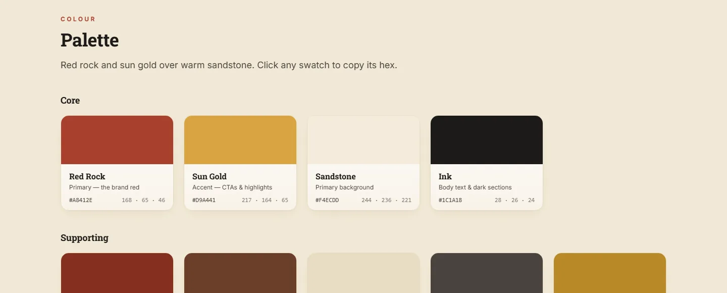
The brand. Most local businesses have a genuine story their template site has buried: a place, a history, a reason they're trusted. For Dixie Chix that story is the red-rock country they work in, so the brand leans into it, warm sandstone and red rock instead of the cold blue every compliance site defaults to.
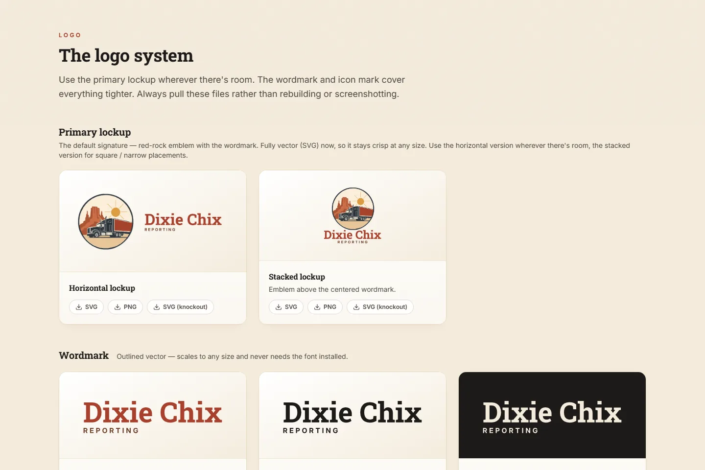
The brand kit. All of it is captured in a brand kit the studio built and handed over: a full logo system, the color palette, the type, a written voice, and even print-ready business cards. It lives as its own page Dixie Chix owns, so the brand stays consistent everywhere, with any printer or sign maker, not just on the website.
Step four | Build: what the project produces
- A written plan: the research, the priorities, and the page map, as a document the client owns
- A full brand kit: logo system, palette, type, voice, and print-ready business cards
- A custom site, built and launched in pieces, starting with the home page, then the inner pages on the same foundation
- A simple quote- or contact-request flow that replaces the old dead-end form


Why it works
This is how I work on every project: a written plan before a design, built around the customers who use the site, shipped in pieces rather than one big reveal. The result is a site that keeps doing its job, not one that quietly falls out of date.